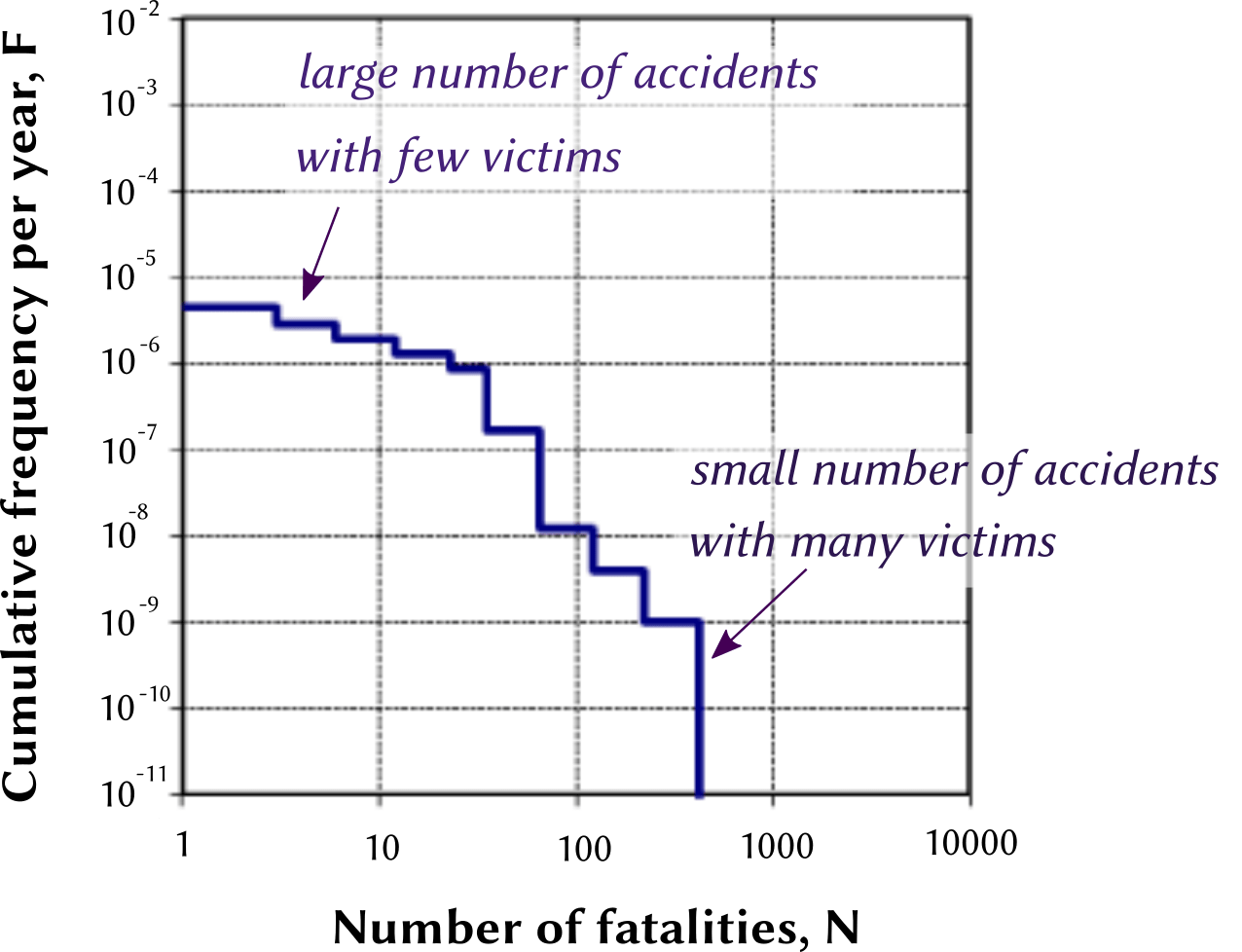
Farmer’s diagram, or F-N curve
Representing society’s degree of catastrophe aversion
Overview
An F-N diagram, also called a Farmer diagram after the name of the first author to have used this representation, is a graphical representation of the level of societal risk generated by a technology, activity or a project. The vertical scale (F) shows the frequency of the events represented, and the horizontal scale represents the consequences (typically the number of deaths, N). A point (F, N) on the curve represents the cumulative frequency of experiencing N or more fatalities due to the activity represented.
A few comments concerning this graphical representation:
a lower curve represents a safer situation (the frequency of the negative events is lower);
F-N diagrams are drawn using a logarithmic scale on both axes, to allow the range of values for both F and N to span many orders of magnitude;
by construction, an F-N curve is always decreasing (falling or flat) from left to right;
obtaining all the estimates needed to plot a full F-N curve is a very resource-intensive exercise, because data is needed concerning the whole range of accident severities, from relatively frequently occurring events for which data is often easy to obtain, to very infrequent events for which little (generally no) operating experience is available, and where estimates are produced using risk analysis techniques.
Alongside information concerning the total number of fatalities generated by an activity (represented by the area under the curve, even if this is difficult to assess graphically due to the logarithmic scales), the F-N diagram provides information on the “scale” of accidents (whether deaths are clustered together). Clustered deaths (high-fatality accidents) are typically more socially sensitive and receive more attention from the media than the same number of deaths “spread out” over a large number of small accidents.
Applications
There are three main applications for a Farmer diagram:
- Representing the historical record of accidents associated with an activity;
- Representing the results of a quantitative risk analysis (QRA);
- Specifying criteria for assessing the tolerability of risk.
These are discussed in the following sections.
Historical information on accidents
The following figure, used in a research report funded by the UK HSE, compares the frequencies and severities of fatal railway accidents with those of road and air transport. It is based on accident data from the period 1967-2001.

High-fatality accidents, represented on the left-hand side of the F-N
curve, are infrequent compared with accidents that individually kill
fewer people (this is not the result of a mathematical law concerning
safety, but rather because large accidents generate considerable
distress and attention from society, and a lot of effort is therefore
put in place to prevent themThis is not necessarily a very rational way for
societies to think about safety and accident prevention. As an
illustration, one of the activity areas which leads to the largest
number of preventable deaths in most industrialized countries is
healthcare. Doctors kill (accidentally) large numbers of patients, but
almost always only one person at a time, so relatively little attention
is paid to preventing these avoidable deaths (for example, there is
little safety regulation in healthcare).
– see the discussion below). There is therefore more
uncertainty on the left-hand side of the plot than on the right-hand
side, where many more observations are available.
Results of a quantitative risk analysis
An F-N diagram can be used to present in a summarized graphical form the results of a quantitative risk analysis, for example in arguments presented to a safety authority in favour of the building or continued operation of a system or facility. The safety authority will check that the estimated F-N curve is within or below the “ALARP” band.
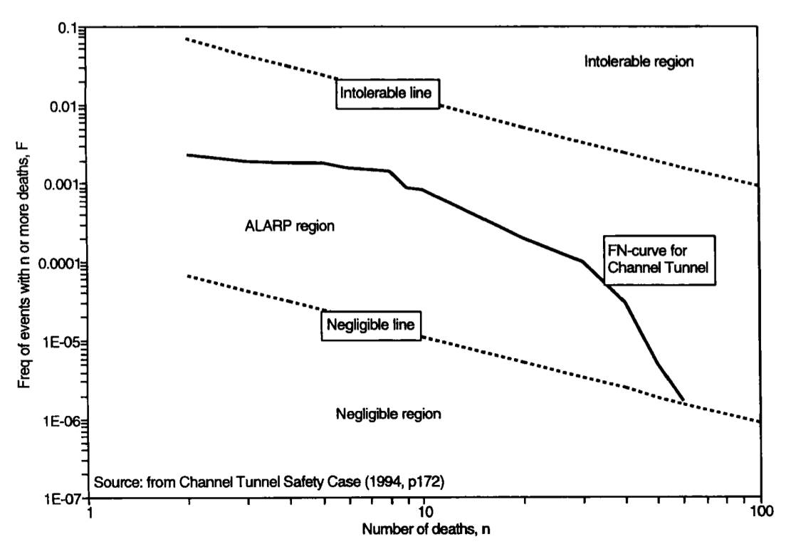
Social tolerability of a hazardous activity
An early use of F-N diagrams was to estimate the social tolerability
of a new hazardous activity. Society must decide what level of risk
imposed by a system or technology is tolerable, given its benefits to
society.See our slides on Risk acceptability
and tolerability for more background information on this
topic.
One method of doing this is to compare the risk
associated with the new system against the risk of similar systems. If
the new system is in an area similar to, or below existing systems, then
the risk is likely to be acceptable.
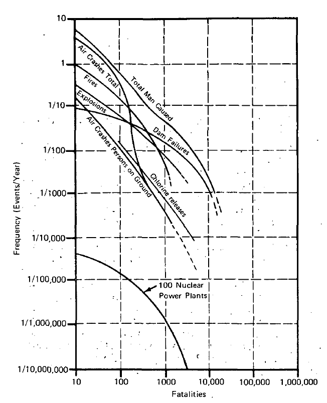
The Rasmussen Report [USNRC 1975] or “Reactor Safety Study”
was an important report published by the US Atomic Energy Commission
(which later became the NRC) in 1975. It reported on the first
full-scope probabilistic risk assessment (PRA) applied to nuclear
reactors, the result of a three-year project led by researcher Norm
Rasmussen from MIT. Published in a context of increasing political
concern regarding the risks of nuclear power, the authors attempted to
illustrate these risks in comparison to other industrial activities,
such as dam failures and airplane crashes, using F-N diagrams.The Rasmussen report was controversial, for a number of
reasons. Some critics argue that its executive summary, which includes
the F-N diagrams we discuss, was more political than technical in
nature, and adopted a more pro-nuclear stance than was justified by the
full content of the report. Other criticism concerns the level of
uncertainty of the inputs used in the probabilistic analysis, which led
to high uncertainty in the output estimates of accident probabilities,
and which later reviews concluded had been underestimated.
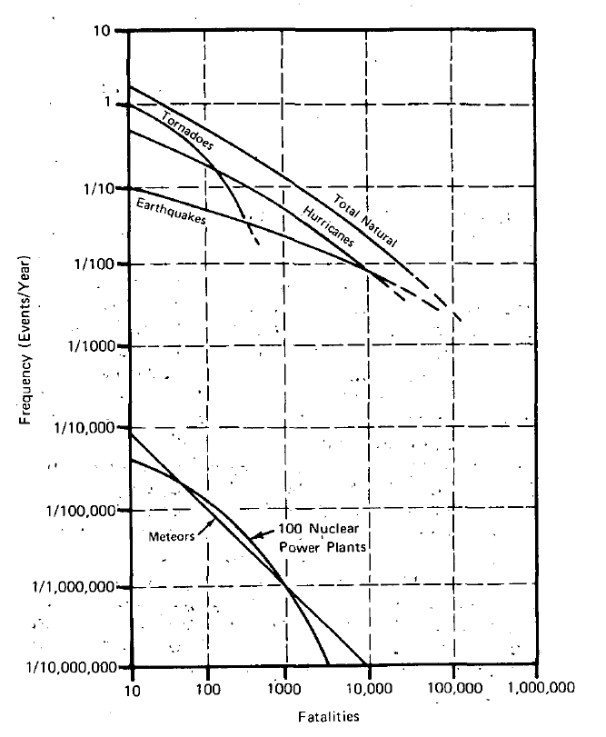
The F-N diagrams included in the executive summary,
reproduced above, compare the accident risks associated with 100 nuclear
reactors (expected at the time to be in operation in the next decade)
with the “risks from other man-caused and natural events to which
society is generally exposed”. The associated commentary points out that
“these figures indicate that non-nuclear events are about 10,000 times
more likely to produce large numbers of fatalities than nuclear plants”,
and that “nuclear plants are about 1000 times less likely to cause
comparable large dollar value accidents than other sources”. This was
the first application of an F-N diagram to discuss social tolerability
of different levels and sources of risk.
When using F-N curves for this purpose, it is important to consider agglomeration effects: an F-N curve concerning an individual plant or facility should not be compared with that for a whole industry sector, because the volume of activity concerned in the two cases is very different.
History of the Farmer diagram
In the mid 1960s, Frank Farmer, a risk analyst who worked for the UK
Atomic Energy Authority, was analyzing the acceptability of iodine 131
leaksIodine-131 is a radioactive isotope of the element
iodine that can be released in case of an accident on a nuclear power
plant. Iodine can be absorbed by humans and will accumulate in their
thyroid, where its presence increases the risk of radiation-induced
cancers. In many countries operating nuclear reactors, people living
within a 20 km radius from a nuclear power plant will receive iodine
tablets to keep in the homes, to be taken in case of a radioactive
release (a procedure called “iodine prophylaxis”). The stable iodine in
the tablets will be absorbed by a person’s thyroid until saturation,
meaning it will no longer assimilate any radioactive iodine that the
person might be exposed to.
from nuclear reactors in the UK [Farmer 1967]. He developed a
quantitative approach to help decide on the best location for a reactor,
based on a probabilistic approach to risk.
His 1967 article includes an introduction to the probabilistic approach to risk:
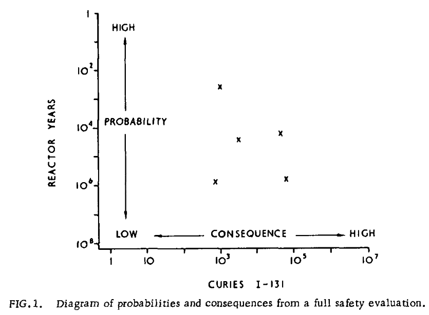
Some assumption of plant failure or maloperation provides the starting point for a safety analysis. A measure of risk can be obtained by estimating the probability of the failure and assessing the consequences. Any initiating event, e.g. failure of pipework, delays in the operation of control systems, loss of circulator power or combinations of these set up an accident sequence which can follow many paths. The likelihood of following any one path depends on the performance of many items of plant and from knowledge of this performance a probability can be assigned to each pathway. The full safety evaluation would then comprise a spectrum of events with associated probabilities and associated consequences. A probability consequence diagram can then be drawn as Fig.1 using as a convenient scale for probabilities the average time interval between events, i.e. reactor years, and for consequences the equivalent ground level release of I-131.
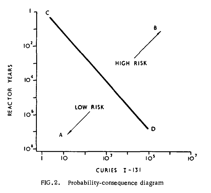
After Farmer, certain people (e.g., [Beattie 1967]) interpreted Farmer’s curve in another way with the limit line in terms of the number of casualties instead of in Curies (a measure of radiation). f-N curves were generated for the first time by Beattie (1967), in which f is the frequency of casualties per year and N is the number of deaths per year. Note that the f was not cumulative in that approach, unlike an F-N curve where the capital F indicates the cumulative nature.
Implications for risk acceptability
A straight line on a log-log plot (such as those used on some of the F-N diagrams shown above to represent the presumed social tolerability of risk) is represented by an equation of the form
F×N^α = k
where α is the slope of the line and k is a constant. This is a power function, or power law.
It’s important to note that this form of model of risk aversion
implies that risk aversion is an exponential function of the severity of
consequences, and not a linear function as in classical economic models
of risk aversion.See our course
materials on the economic approach to risk transfer for some
background information on this issue.
In the standard approach to risk aversion, a risky
situation with a certain level of consequences and a certain probability
is assumed to be considered in the same way in decision-making as a
situation with twice the consequences but half the probability.
The exponential included in the power law implies additional aversion to multi-fatality events, or what’s called catastrophe aversion in economics. Catastrophe aversion is a measure of people’s preference for accidental deaths or other negative consequences to be clustered together (small number of severe accidents) rather than unclustered (a large number of small accidents). It has large impacts on risk management in industry, because catastrophe averse preferences make it far more expensive to build high-hazard facilities, that can lead to large numbers of simultaneous deaths (even if with a very low likelihood).
An F-N slope equal to -1 (a -45° angle) implies catastrophe neutral preferences (purely risk-based). This implies that the frequency of an event that results in 100 or more fatalities must be 10 times lower than the frequency of an event that results in 10 or more fatalities. A slope smaller than -1 implies catastrophe aversion preferences, i.e. a greater concern for events that generate larger numbers of fatalities. For example, if the F-N curve slope is equal to -2, the criterion would dictate that the frequency of an event that results in 100 or more fatalities should be 100 times lower than the frequency of an event that results in 10 or more fatalities.
Some organizations have developed societal risk criteria that use a moderate slope (e.g., -1) for low values of N, with an increase in slope (e.g., -2) for higher values of N.
As pointed out by CCPS Guidelines for Developing Quantitative Safety Risk Criteria (2009):
Multiple fatality risk aversion says, in effect, that a fatality is more significant when it is accompanied by a large number of other fatalities. If preventing rare, high-consequence events requires disproportionate risk reduction efforts (in contrast with preventing more likely events), such efforts would run counter to a concept to which many risk analysts ascribe - that the most effective allocation of risk reduction resources is that which maximizes the number of lives saved.
References
Beattie, J. R. 1967. Risks to the population and the individual from iodine releases. Nuclear Safety 8(6):573–576.
Farmer, Frank R. 1967. Siting criteria: A new approach. In Proceedings of a Symposium on the Containment and Siting of Nuclear Power Plants, Vienna, April 3–7, 303–329. IAEA. https://www.iaea.org/inis/collection/NCLCollectionStore/_Public/44/070/44070762.pdf.
USNRC. 1975. NUREG-75/014 (WASH-1400) Reactor safety study, an assessment of accident risks. Washington, D.C. US Nuclear Regulatory Commission. [Sci-Hub 🔑].
Published:
Last updated: